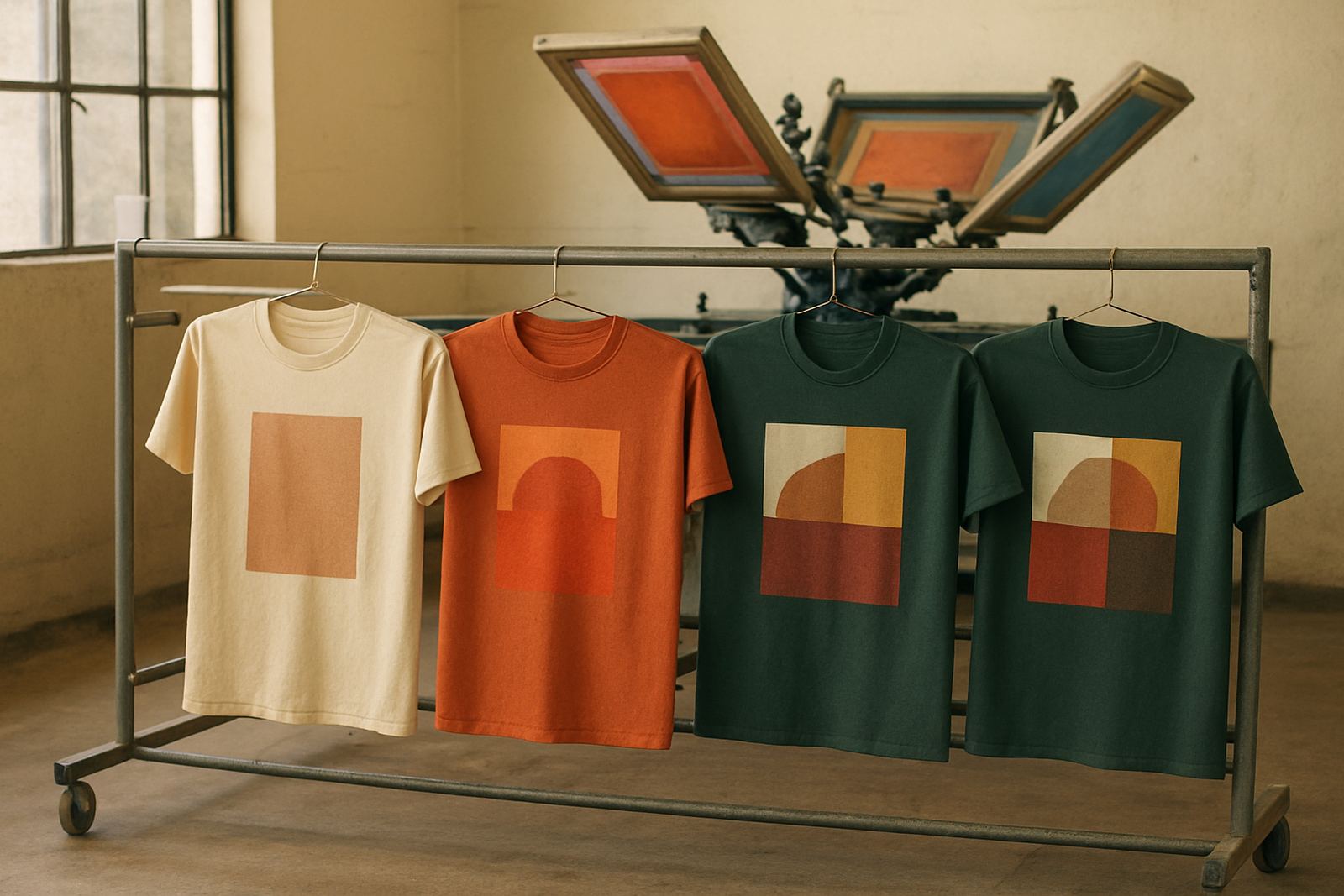
Why the colour count changes the whole job
When clients ask how many colours they should use, the answer is not always “as many as possible”. Each extra colour means another screen, another setup step and another point where alignment has to be checked. For a simple staff shirt in Bloemfontein, a one-colour logo can be quick and cost-effective. A four-colour design for an event tee can look striking, but it needs more planning and a longer production window.
Screen printing works best when the design matches the order size and the garment. If you are printing 20 uniforms for a small team in Hamilton, fewer colours can keep the job practical. If you are printing 500 shirts for a school fun run in Thaba Nchu, extra colours may be worth it because the visual impact is seen from a distance and the unit cost spreads across the batch.
- More colours usually mean more setup time
- Each colour needs its own screen and registration check
- Smaller orders often work better with fewer colours
- Large runs can absorb extra setup more easily
How many colours suit different kinds of apparel
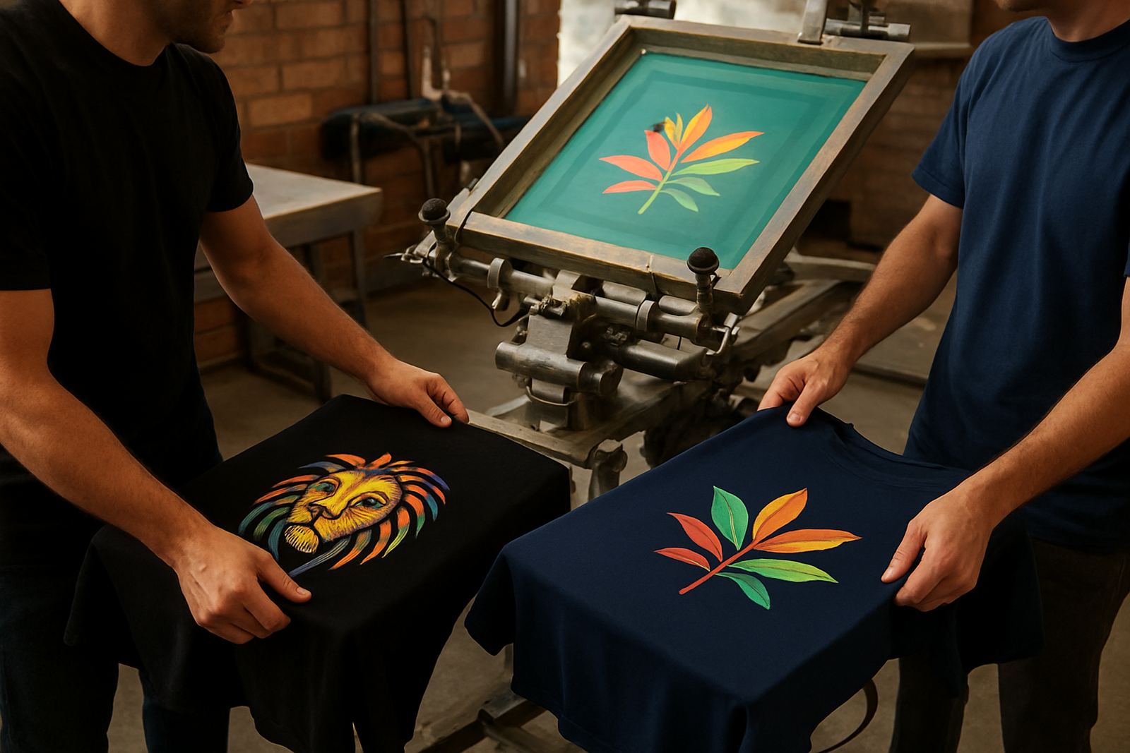
Different garments call for different approaches. A dark cotton shirt for a warehouse team in Botshabelo may need a bold two-colour print so the logo stands out. A sports vest for a school tournament in Bethlehem may need a bright three-colour design, especially if the team wants names, numbers and a sponsor mark. For uniforms, fewer colours often look cleaner and stay easier to repeat across future orders.
Clients sometimes want full detail in a small print area, but that can make the design crowded. If the logo has shading, thin outlines or lots of tiny text, it may need simplification before it can print well. This is where colour matching and artwork setup matter. A good artwork layout keeps the design sharp and makes sure the colours separate properly on press.
- 1 colour: strong for simple logos, back prints and budget-conscious orders
- 2 colours: good for team wear, school shirts and clear brand marks
- 3 to 4 colours: suited to detailed event shirts and promotional apparel
- 5 or more colours: best planned carefully for larger orders and high detail artwork
What extra colours mean for price and production time
Extra colours do not only affect appearance. They also affect production planning, drying time and the order sequence on press. In summer, when humidity picks up in some Free State towns, drying can take a bit longer. In winter, load-shedding can also affect scheduling, so a multi-colour run may be split across stages to keep the job moving. That is why planning matters before production starts.
A three-colour design may look similar to a one-colour design from a distance, but the job behind it is very different. You are paying for more preparation, more checks and more handling. That is normal for screen printing. The point is not to avoid colour, but to use it where it adds value. If the colours help the shirt look more professional or make the message easier to see, they can be worth the extra cost.
- More colours usually increase the setup charge
- Repeating a design later is easier when the artwork is already approved
- Longer production time can affect courier cut-offs
- Good planning helps avoid rush work and last-minute changes
When fewer colours give a better result
There are times when a stripped-back design works better than a busy one. A white logo on navy workwear can look smart, tidy and easy to read. A single solid colour can also hold up better on textured fabrics, cheaper cotton blends and garments that will be washed often. For schools and companies that need regular reorders, a simple print is often the safest choice because it is easy to match next time.
Less can also mean fewer production issues. Fine gradients, very light colours on dark fabric and tiny text can become difficult to print consistently. If the goal is long-lasting visibility, a cleaner design often outperforms a more complicated one. That is especially useful for safety shirts, transport uniforms and event wear where the message has to be seen quickly.
There is no rule that says a good shirt must use many colours. The best result is the one that suits the purpose, the garment and the budget.
Planning a multicolour print for your next order
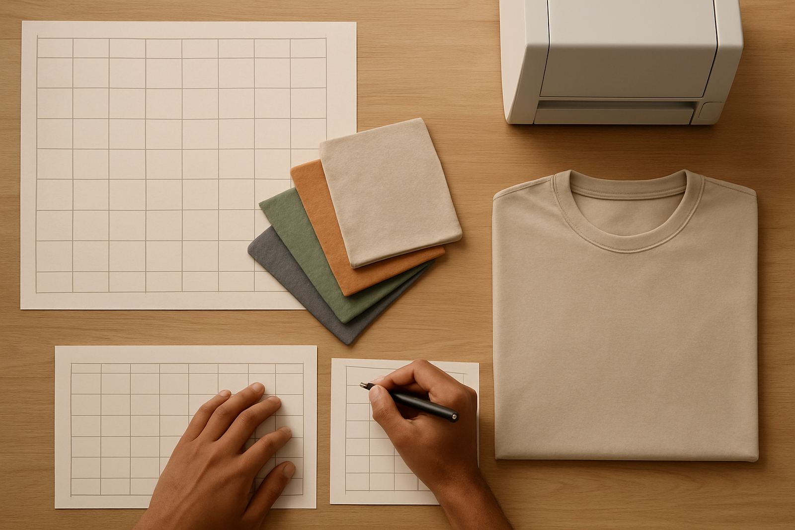
If you are ordering from Bloemfontein, Welkom, Kroonstad or Parys, it helps to decide on the colour count early. That makes it easier to sort sizes, confirm artwork and plan dispatch. For bigger batches, the details matter: the shade of the fabric, the print placement, whether names are added and whether each shirt is bagged individually for distribution at a school, office or event venue.
Before the job goes ahead, it helps to ask a few practical questions. The answers will usually show whether your design should stay simple or can carry more colour without becoming expensive or difficult to produce.
- Is the design meant for one event or repeated use?
- Will the shirt be worn on dark or light fabric?
- Does the logo need to be seen from far away?
- Are sizes, names or numbers changing from one shirt to the next?
A local example from Hamilton to Bethlehem
A school in the Bloemfontein area may want shirts for a sports day and ask for a full colour design because the artwork looks lively on screen. But once the print size, fabric and order quantity are checked, the team may find that a two-colour version gives better clarity and a cleaner finish. The school still gets a strong visual identity, but the order is easier to print, easier to repeat and less likely to run into delays.
That is the real value of asking how many colours you need. It is not only about style, it is about making a print that works in practice. Whether the order is for uniforms, event shirts or sportswear, the right colour count helps balance cost, impact and production time without compromising the result.
For businesses and schools across the Free State, the best design is often the one that looks good, prints well and arrives on time.