Why Light Shirts Make Artwork Easier to Read
Light shirts give printed artwork a cleaner base, so fine details are easier to see and text stays legible from a distance. That matters when you are printing a school name, a team slogan, a safety message or staff role titles on uniforms.
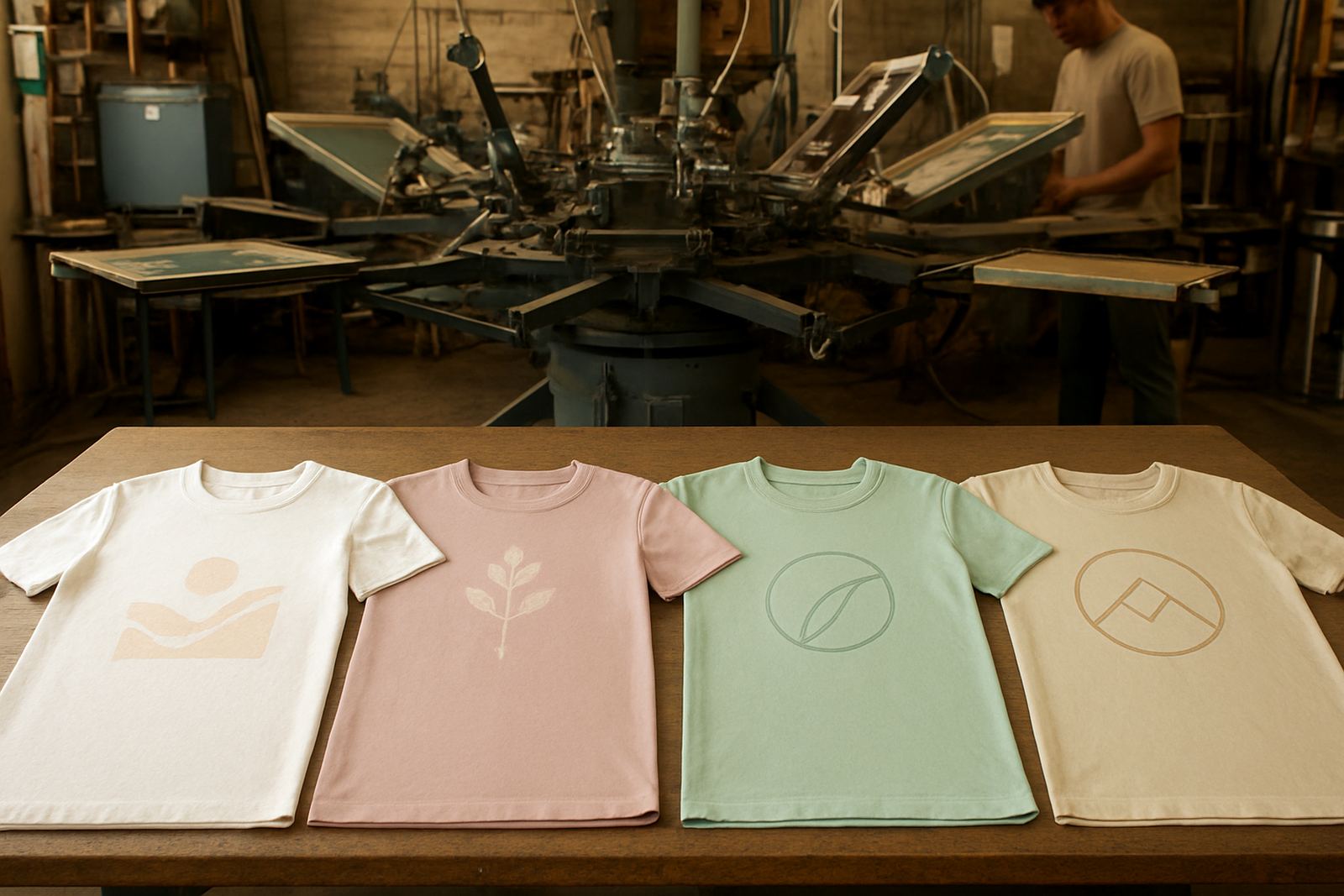
On white, cream, pale grey or soft pastel garments, dark inks usually stand out well without needing heavy layers. That can help reduce the risk of muddy colours, especially when the logo has small lettering or a simple line drawing. For a company in Hamilton or a school in Botshabelo, that means the finished item can look tidy from the first wear.
Colour Matching Works Better on a Pale Base
One of the main advantages of light shirt printing is how predictable the colour can be. Bright reds, blues, greens and black normally hold their character more easily on a pale fabric base, while lighter tones are less likely to disappear into the cloth.
That does not mean every colour behaves the same way. Soft yellows and light oranges can need extra care, and pale artwork may need a stronger outline if you want it to show clearly. A proper artwork check helps avoid disappointment, and it is worth asking for a sample view before you approve a larger run.
- Darker logos often look crisp on white or light grey shirts
- Small print sizes are easier to read on a plain pale base
- School crests and event graphics usually need less visual correction
- Colour matching can be checked before bulk production starts
Best Uses for Light Garments in the Free State
Light garments work well for a wide range of local jobs because they suit warm weather, indoor events and casual uniforms. In the Free State, many clients choose them for spring campaigns, school functions and sports days, where the clothing must look clean and simple without feeling too heavy.
They are also practical for couriered orders across Welkom, Bethlehem, Kroonstad and Parys, where teams may need one design printed across different sizes. If you are ordering for an event with mixed age groups, light shirts can make sizing and reordering easier because the same print often works across a broader range of garments.
- School trips and fundraisers
- Staff shirts for events and promotions
- Sports tour shirts and warm-up tops
- Community outreach and volunteer clothing
- Retail promotional wear for short campaigns
Printing Detail Depends on Fabric and Finish
Light shirt printing is not just about choosing a pale colour. The fabric type, weave, stitch quality and finish all affect how the print settles and how long it stays neat after washing. Cotton shirts usually take ink differently from poly cotton blends, and that affects both the feel and the final look.
A smoother fabric can suit sharper line work, while a slightly heavier shirt may give more confidence for larger logos and bold shapes. If the garment is very thin, you may see more show-through from the ink or the shirt underneath when it is stretched. For that reason, the garment choice should be checked before production starts, not after.
In Bloemfontein, where some orders are collected in person and others are sent out by courier, it helps to confirm the exact shirt colour and fabric count early. That keeps the print consistent whether the order is for a single branch or a full province-wide rollout.
When Light Shirts Save Time and Reduce Rework
Light garments can save time because they are generally easier to proof, easier to approve and easier to match across repeat orders. If you need a fast turnaround for a school athletics day or a trade event in Hamilton, you often want less back-and-forth on artwork and colour selection.
They can also reduce rework when the design is simple. A dark logo on a pale shirt usually needs fewer changes than a pale logo on a dark shirt, which means fewer surprises in the sample stage. That is useful for bulk order printing where size sorting, individual bagging and dispatch all have to happen on time.
- Less risk of artwork disappearing into the fabric
- Cleaner approval process for teams and committees
- Useful for repeat orders with the same logo
- Often a good choice when deadlines are tight
A Local Example from Bloemfontein and Surrounds
A small office team in Bloemfontein may want light shirts for a Friday promotion, while a school in Thaba Nchu may need the same style for a sports day and prize giving. In both cases, a pale garment can keep the logo readable and the overall look neat without adding unnecessary cost or complexity.
Suppose a client needs 80 light grey shirts for a community event, with names on the front and a sponsor mark on the back. The artwork is easier to position on a light garment, and the final result is usually simpler for volunteers to wear and care for. Even when the order is split between sizes, the print can stay consistent across the batch if the garment colours are kept within the same range.
That is why many businesses and schools in Botshabelo, Welkom and Kroonstad keep a light-shirt option in mind for recurring campaigns. It is a practical choice, not just a visual one.
What to Check Before You Place an Order
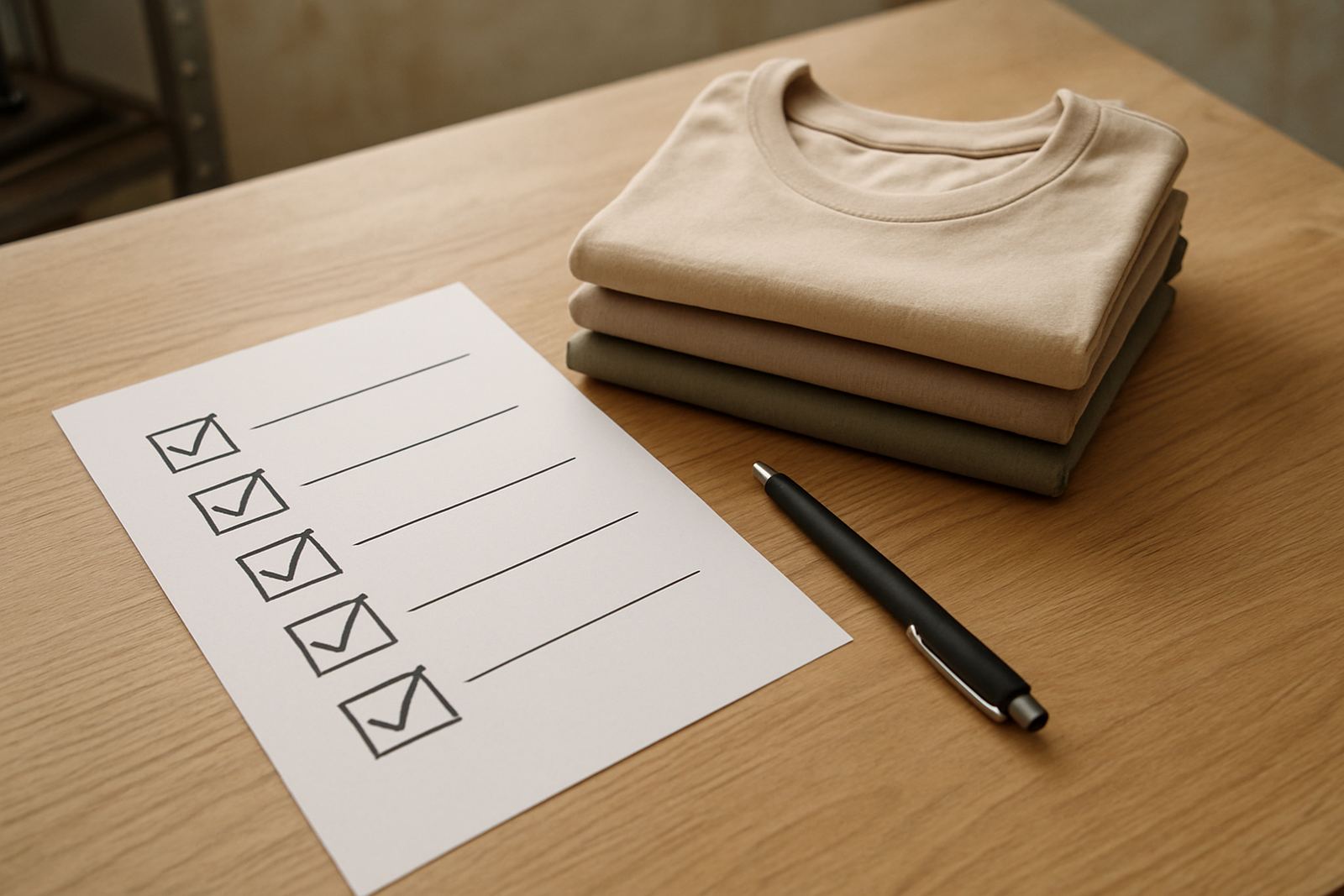
Before you confirm light shirt printing, it helps to work through a few basics. These checks can prevent delays and make sure the final garments suit the people who will wear them.
- Confirm the shirt colour, fabric and weight
- Check whether the artwork has fine lines or small text
- Decide if names, sizes or roles must be added
- Ask how the garments will be packed for handout or dispatch
- Make sure the order quantity matches your actual event or staff list
If the order is for a business, school or event, it is worth getting everything right the first time. Light garments give you room to keep things clear, readable and easy to manage, especially when the print needs to travel by courier across the Free State or farther afield.