
Start with the job the garment must do
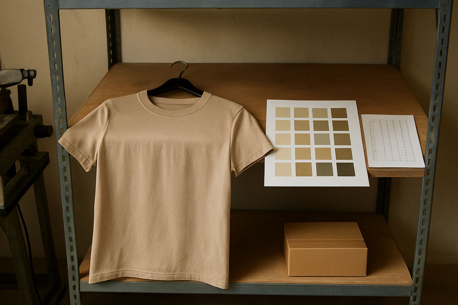
Before you pick a colour, work out where the garment will be worn and what it must say at first glance. A staff uniform for a retail counter in Bloemfontein needs a different colour from a school event shirt for a sports day in Thaba Nchu or a promotional tee handed out at a weekend market in Hamilton. The best colour is not always the one that looks nicest on a sample card, it is the one that supports the work.
For screen printing, garment colour affects how clearly the artwork shows up, how much contrast you get and whether the item still looks smart after repeated washing. Dark shirts can hide stains better, while lighter shirts can feel cooler in the Free State heat. If the garment is for outdoor use, dusty sites or regular handling, practicality should come first.
- Choose visibility for events and public-facing staff.
- Choose stain hiding for workwear and site use.
- Choose comfort and heat control for long outdoor shifts.
- Choose a colour that fits the group using it every week, not just once.
Think about contrast before you think about colour trends
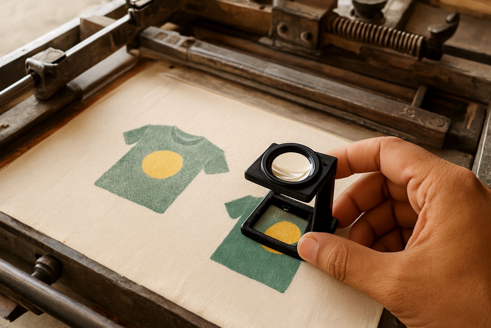
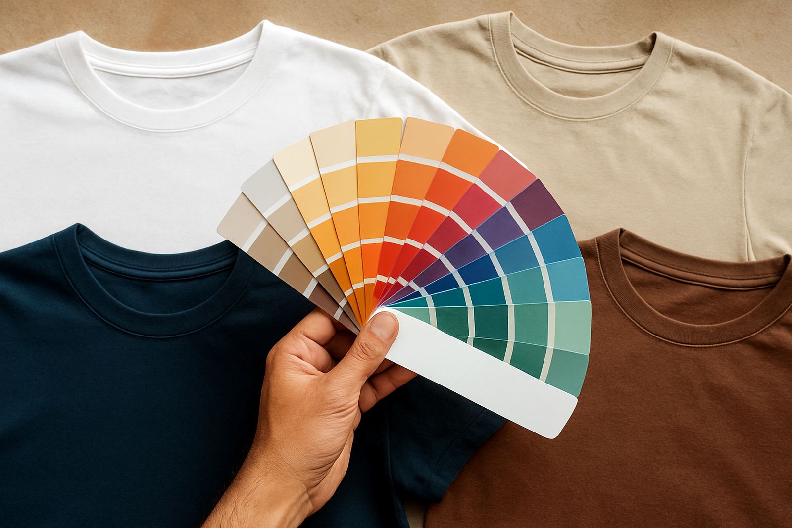
Good print results depend on contrast. White ink on a pale yellow shirt can disappear from a distance, while black ink on navy may feel too quiet unless the artwork is bold enough to carry itself. This is why the garment colour and the ink colour should be planned together.
When we help clients with artwork setup and colour matching, we look at the logo, the fabric shade and the purpose of the item as one decision. A school crest, for example, needs strong readability from a few metres away. A company name on a navy golf shirt should be easy to read under office lighting and in bright sunlight too.
- Use dark garment colours for light ink, if the design must stand out.
- Use light garment colours for dark ink when you want a cleaner, brighter look.
- Avoid mid-tone on mid-tone combinations unless the artwork is large.
- Check the print in daylight, not only under indoor lighting.
Match the colour to the real South African setting
South African conditions affect how a garment colour performs. In the Free State, many teams deal with heat, wind, dust and strong sun. A white or light grey shirt can feel cooler for road crews and sports days, but it may also show marks faster. A darker colour such as navy, charcoal or black can look neat for longer, but it will hold more heat when people are outside for hours.
Coastal humidity brings another issue. In places with moist air and frequent washing, some colours can show fading faster if the fabric quality is poor. That is why the garment colour should be chosen with the fabric, print method and care instructions in mind. A colour that suits indoor retail staff may not suit a construction team or a school tuckshop team moving around all day.
For clients in Bloemfontein, Welkom or Kroonstad, we often suggest colours that hide dust well while still giving enough contrast for a clean print. For events in Parys or Bethlehem, brighter shades can help volunteers and crew members remain easy to spot in a crowd.
Use colour to support branding, not fight it
Every brand has a colour identity, but not every brand colour works well on every garment. If your logo is already busy, the shirt should keep things calmer. If the logo is simple, the garment can carry more visual weight. The goal is balance.
One practical rule is to keep the garment colour in the same family as the brand, but not identical unless that exact shade prints well and holds up in daily wear. For instance, a school may use maroon in its crest but choose white, grey or navy shirts for better legibility and easier coordination across sizes. A business may want its staff in black, yet a lighter shirt could be more suitable for summer promotions or outdoor delivery work.
- Choose neutral colours when the logo already has multiple colours.
- Use brand colours more boldly for limited event runs.
- Keep a second garment colour for seasonal use, such as summer and winter.
- Make sure the background colour does not clash with the printed text.
Plan for washing, wear and everyday use
The nicest shirt on day one is not always the best shirt by week six. Garment colour should be chosen with washing cycles, sweat marks, sunscreen, dust and general wear in mind. This matters for schools, sports clubs, warehouse teams and event staff who need their garments to keep looking presentable.
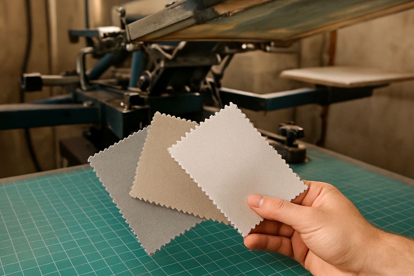
Dark colours can hide small marks, but they may show lint and dust more easily. Light colours can look fresher for longer if they are washed often and handled carefully, but they may stain faster in practical settings. If the team works with food, on a building site or in a high-touch environment, a mid-tone colour often gives the best compromise.
- Black and navy are practical for wear and grime, but can show dust.
- White and pale grey feel cooler but need tighter care.
- Charcoal, royal blue and bottle green often give a good middle ground.
- Always ask who will wash the garments and how often.
A simple method for choosing the right shade
If you are unsure, narrow the choice down with a simple step by step approach. Start with the purpose, then the print colour, then the people wearing it, and finally the environment. That order saves time and avoids expensive mistakes on bulk orders.
For a Bloemfontein school event, you might first need bright visibility, then strong logo contrast, then comfort for children moving between activities. For a corporate order in Hamilton, you may need a neater, more formal look that works with uniforms already in use. For nationwide couriered orders, colour choice also needs to be consistent from the first carton to the last, so size sorting and careful batch control matter.
When you are comparing options, ask these questions:
- Will this colour still look right after 20 washes?
- Does the logo read clearly from 3 to 5 metres away?
- Will the colour suit both staff and customers seeing it in daylight?
- Is this a one-off event shirt or a repeat uniform item?
If the answer to any of these is uncertain, simplify the colour choice. Clear and practical often works better than trying to be clever.
Why local guidance helps with colour choices
Choosing garment colours is easier when the supplier understands local use. A team in Botshabelo may need different practical advice from a school in Bethlehem or an event organiser in Parys. Local orders often need quick decisions, bulk consistency and delivery that keeps to schedule. That is why it helps to work with people who handle the full process from artwork setup to dispatch.
At Screen-Printers Service in Hamilton, Bloemfontein, we work with businesses, schools and events across the Free State and nationwide. We consider the garment colour, the print method, the size range and the final use before anything goes to production. That keeps the result readable, wearable and suitable for the job at hand. A good colour choice saves time, money and a lot of back and forth later on.
In the end, garment colour is not just a style choice. It affects legibility, comfort and how well the item performs in real life. The right shade helps the print do its work and keeps the garment useful long after the first wear.